Cédric Scherer
@CedScherer
Inactive account → find me on BlueSky and LinkedIn 🧙♂️✨📊 Independent #DataViz Consultant & Designer 👨🎓🌿🐗 PhD in Computational Ecology
📊🧵 Collection of tweets featuring open-access materials that I have shared over the last years: Talks, seminars, blog posts, hands-on notebooks, codes, and more! #rstats #ggplot2 #tidyverse #dataviz 🧙♂️


#dataviz is a long, iterative process. If you want to learn the required steps to create a great graph with R and ggplot2, we are building something for you with @CedScherer ! ggplot2-uncharted.com
🚀 New content coming soon to our interactive #ggplot2 workshop! “Principles of ggplot2” includes fun interactive widgets to explore plot components 🖥️ 💸 Early-bird discount still on – check it out: ggplot2-uncharted.com #rstats #dataviz

Our ggplot2 [un]charted course is live! 🎉 Lesson 1, “Why R and ggplot2?”, is free to explore — short, thoughtful & a bit different. Get the early-supporter price! 👉 ggplot2-uncharted.com Follow along as new content drops and learn while running your code in the browser 👩💻
Excited to launch "ggplot2 [un]charted" with @R_Graph_Gallery! 🎉 An online course to master #DataViz with #ggplot2 with exercises, quizzes, modules—and hands-on #Rstats code running in your browser! Still WIP—sign up now for a limited discount! 👉 ggplot2-uncharted.com
![CedScherer's tweet image. Excited to launch "ggplot2 [un]charted" with
@R_Graph_Gallery! 🎉
An online course to master #DataViz with #ggplot2 with exercises, quizzes, modules—and hands-on #Rstats code running in your browser!
Still WIP—sign up now for a limited discount!
👉 ggplot2-uncharted.com](https://pbs.twimg.com/media/Gqwq_mzXsAInfcM.jpg)
⏰ Last call! If you want to create stunning charts with Python, there are a 8 hours left only to join Matplotlib Journey! matplotlib-journey.com Thanks so much to the 414 people who joined already! 🙏 Graph by the awesome @CedScherer, python repro by @joseph_barbier
R blows my mind. All of these were made with R by Cédric Scherer (3 is my favorite):
Measuring streamflow droughts can be a statistical challenge! Recently, I stumbled upon an interesting project in this field. The analysis of "100 Years of Streamflow Droughts," shared in a recent post by @CedScherer, highlights a significant project in collaboration with the…
I'm in Washington DC for a few days to host a workshop 🧑🏫 If you're around, feel free to reach out—I'd love to connect and hang out!

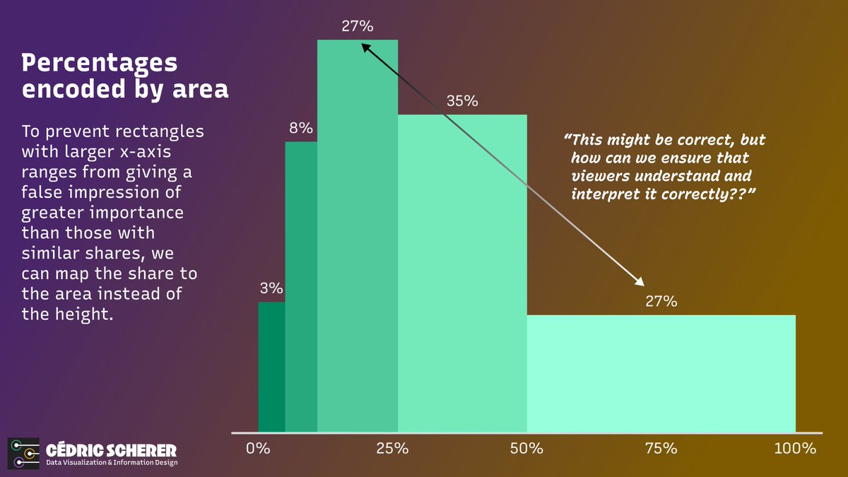
📊 Have you ever needed to create a bar chart when data is aggregated in groups of different ranges? #dataviz While researching the pros and cons, I couldn't find a consensus on what the "best" approach is. "It depends" is, as often, the best recommendation I could find.
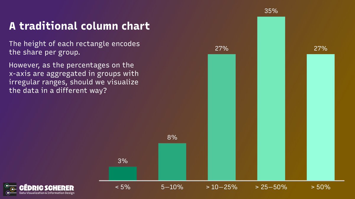
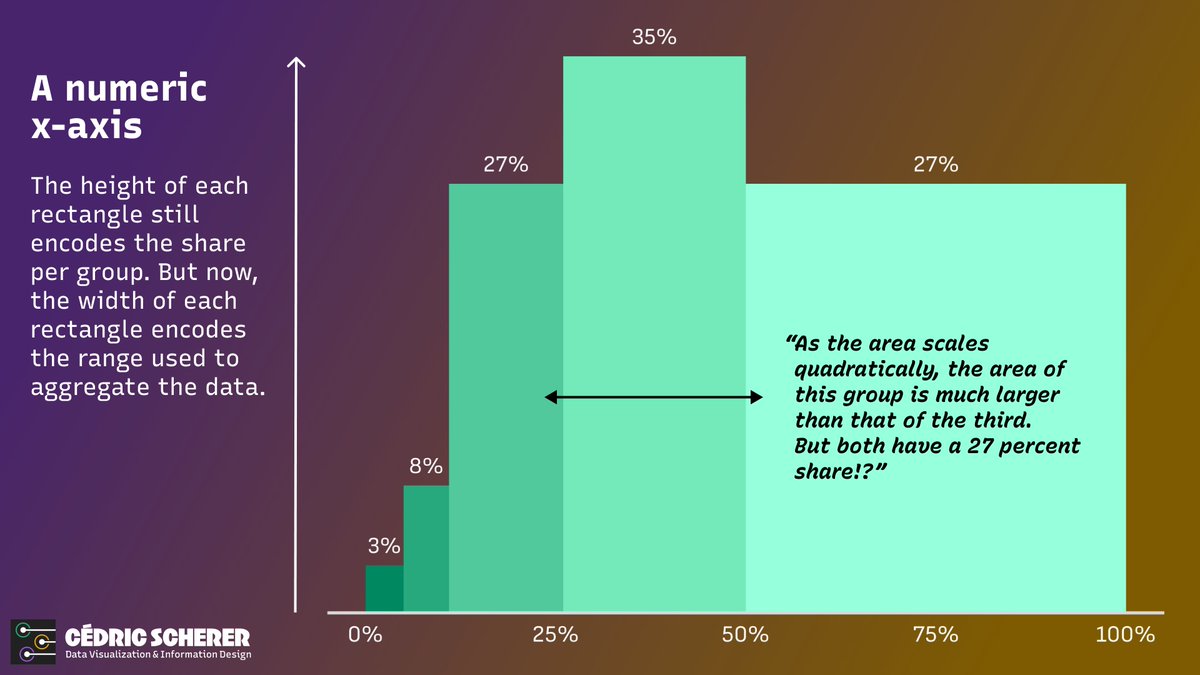

When people ask for the y-axis to be extended to zero, it’s because they want to know whether a trend or movement is significant. The way to show that is by extending the *x-axis* (because showing a longer time series implicitly shows whether or not something is within the…
Land doesn't vote, people do! French edition. 🗳️ Each municipality was transformed into a dot, with the area of the dot proportional to the number of voters 👉 a more accurate representation of voting patterns. Nonetheless, right-wing support 🟤 remains concerning.
Nicht die Fläche wählt, sondern die Menschen! Für die Darstellung wird jeder Landkreis in einen Punkt umgewandelt, wobei die Größe des Punktes proportional zur Anzahl der Wähler-/innen ist 👉 das Wahlergebnis wird dadurch besser abgebildet und weniger verzerrt.
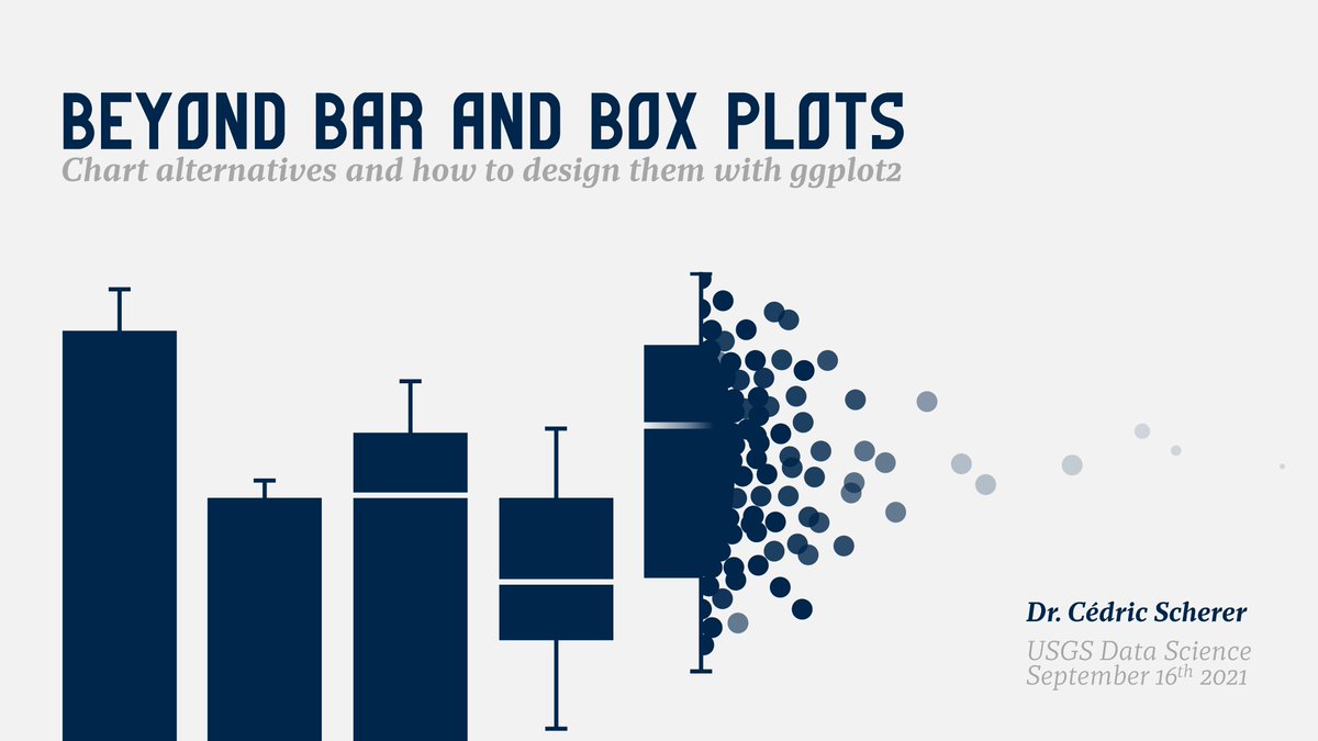
On Friday I am giving a talk at the #data2speak conference 2024! You can watch my presentation and many other great talks for free 💸 📚 "Print's (not) dead — creating graphics for reports and books" 📅 Friday, May 10 🕒 14:55 GMT // 16:55 CEST #dataviz #datavisualization