Observable
@observablehq
Make it make sense
In Observable Canvases, AI is transparent and verifiable, so you can confidently use it throughout your data analysis. Discover how AI streamlines data exploration by accelerating data profiling, automating data wrangling, and drafting interactive charts: buff.ly/OyyRzv4

AI can fast-track your data analysis, but only if you can trust its outputs. In Observable Canvases, you can see, verify, and interpret AI outputs every step of the way. Learn how our transparent AI gets you from messy tables to trusted insights, faster: buff.ly/B3H8cSG

AI in Observable Canvases is transparent, so you can boost your data analysis while maintaining confidence in the results. We expose the logic and code at each step for AI outputs that you can immediately verify, and more easily interpret. Learn more: buff.ly/B3H8cSG

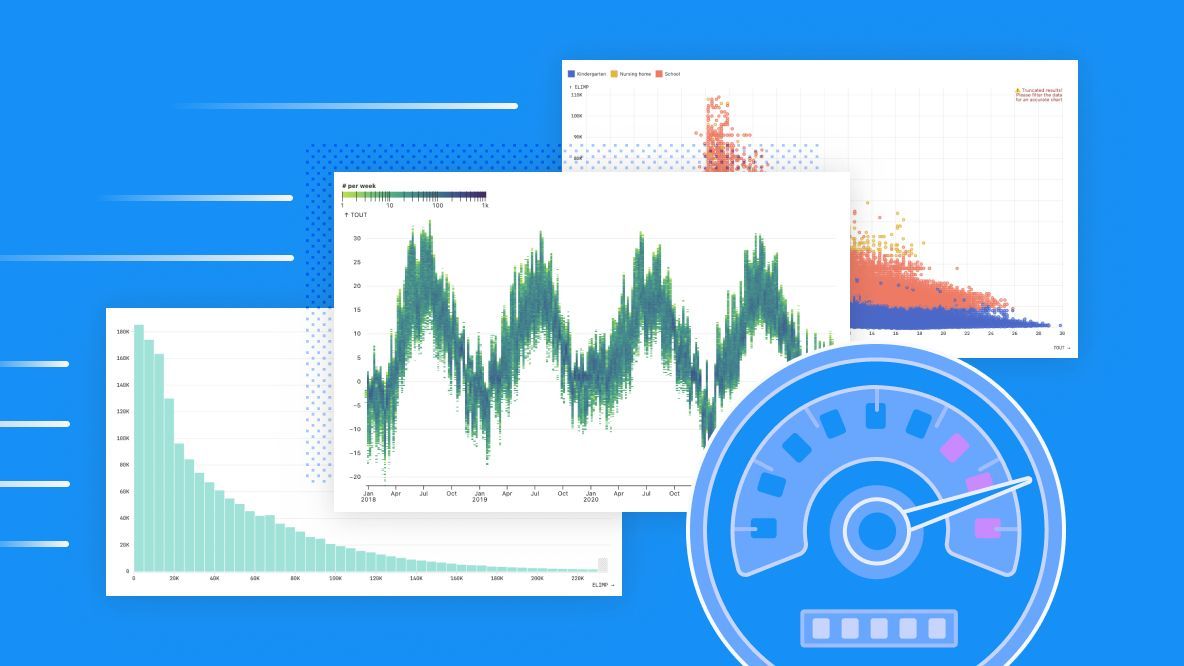
Big data usually means slow charts, but not in Observable Canvases. Our optimized queries power fast, interactive visualizations so you can explore more, and wait less, to find insights faster. Learn how we keep charts fast, even with big data: buff.ly/eOSF8Vt
The hardest part about reusing charts can be getting your data into the expected shape. Learn common data formats consumed by Plot & D3 — and how to transform your data to match — so you can quickly reuse thousands of stunning, interactive visualizations: buff.ly/rJaX6pT

When working with big data for BI, data visualizations can be painfully slow to load. That stifles exploration and iteration, which means you might be missing out on business insights. In our new post, learn how we keep charts fast in Observable Canvases: buff.ly/uulZzGc

Update: The Heroku outage we reported on earlier today, which may have temporarily caused issues with data connectors in Observable products, is now resolved.
Due to an ongoing Heroku outage, we are experiencing issues with data connectors. This may impact your use of Observable or cause further disruptions to our services. We will monitor the situation and provide updates as appropriate.
Histograms are incredibly useful, interpretable, and common in BI. But building histograms that work well out of the box for any data is tricky. We share some of the challenges faced, and decisions made, when designing histograms for Observable Canvases: buff.ly/8xnsl2A

Data analysts spend their days knee-deep in company data, so they are uniquely positioned to help teammates find, use, and trust analyses that can improve their work. Learn how analysts can contribute to a stronger data culture across their organization: buff.ly/JrTdLNH

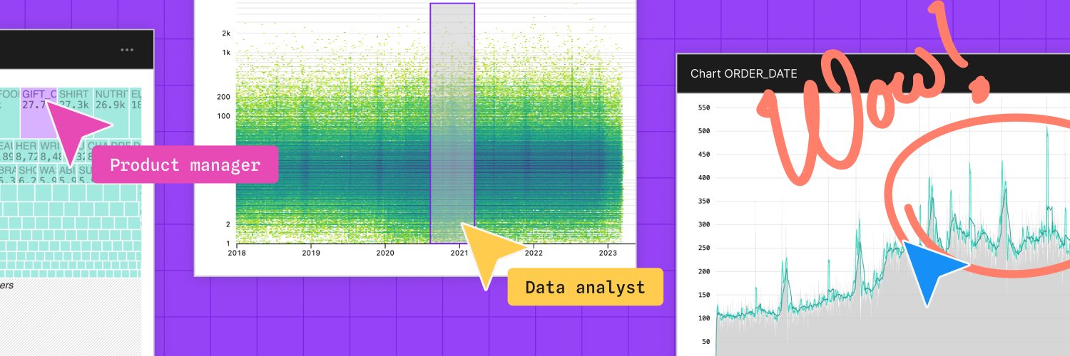
When data visualization is confined to initial exploration and final storytelling, you can miss out on insights, anomalies, and mistakes that get revealed in between. Learn how end-to-end visual data analysis helps your team uncover insights, and errors: buff.ly/JzNrEPw
Most BI tools let you make histograms with one click. So, you might think that designing good default histograms is simple. Turns out, it's harder than it sounds. Learn how we handle common challenges to make better out-of-the-box histograms in canvases: buff.ly/WlIEc4o
Including collaborators and stakeholders throughout analysis helps to avoid redundant work, crossed wires, and rehashing decisions at the project finish line. Learn how collaborative analytics gets you from raw data to trusted business decisions, faster: buff.ly/v65yvHD

With end-to-end visual data analysis, you can keep eyes on your data throughout the analysis process. Learn how that helps you discover unexpected value in your data, catch mistakes earlier, and improve cross-functional collaboration: buff.ly/Y4QGVZx
Collaborative analytics brings data teams and stakeholders into the analysis process from ideation to final product. Discover how that helps you all reach the finish line, faster: buff.ly/v65yvHD

Join us May 20 at 10 AM PT for a first look at Observable Canvases. Learn how canvases support fast, visual data exploration and analysis, with whiteboarding tools that let data teams and stakeholders all participate in the same place. Sign up today: buff.ly/TjsahdU

In Observable Canvases, data teams can break free from linear workflows to explore data in branched, visual analyses across an infinite canvas. Work seamlessly between code and UI, and collaborate with stakeholders using whiteboarding tools: buff.ly/oMQH5Kf

Ever built a chart only to have people misread it, or miss key insights? Annotations can make all the difference. Here are five ways you can uplevel your chart annotations for improved context, clarity, and interactivity (with reusable examples and code): buff.ly/o2mD6OV

In Observable Canvases you can write queries in SQL, build custom charts in JS, or wrangle and visualize data using UI options. Seamlessly mix methods across the infinite canvas, with the freedom to choose how you work with data at each step. Learn more: observablehq.com
Observable Canvases get data teams and stakeholders all in one place, with the context they need to fearlessly explore and analyze data together. Learn how canvases (now in early access) can help teams make faster, better, more trusted business decisions: buff.ly/F1CCrQn
