Onyinye✨
@miracleorji___
UI/UX Designer | 👩💻Sharing my design journey | Learning and growing ✨
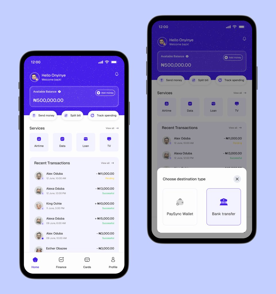
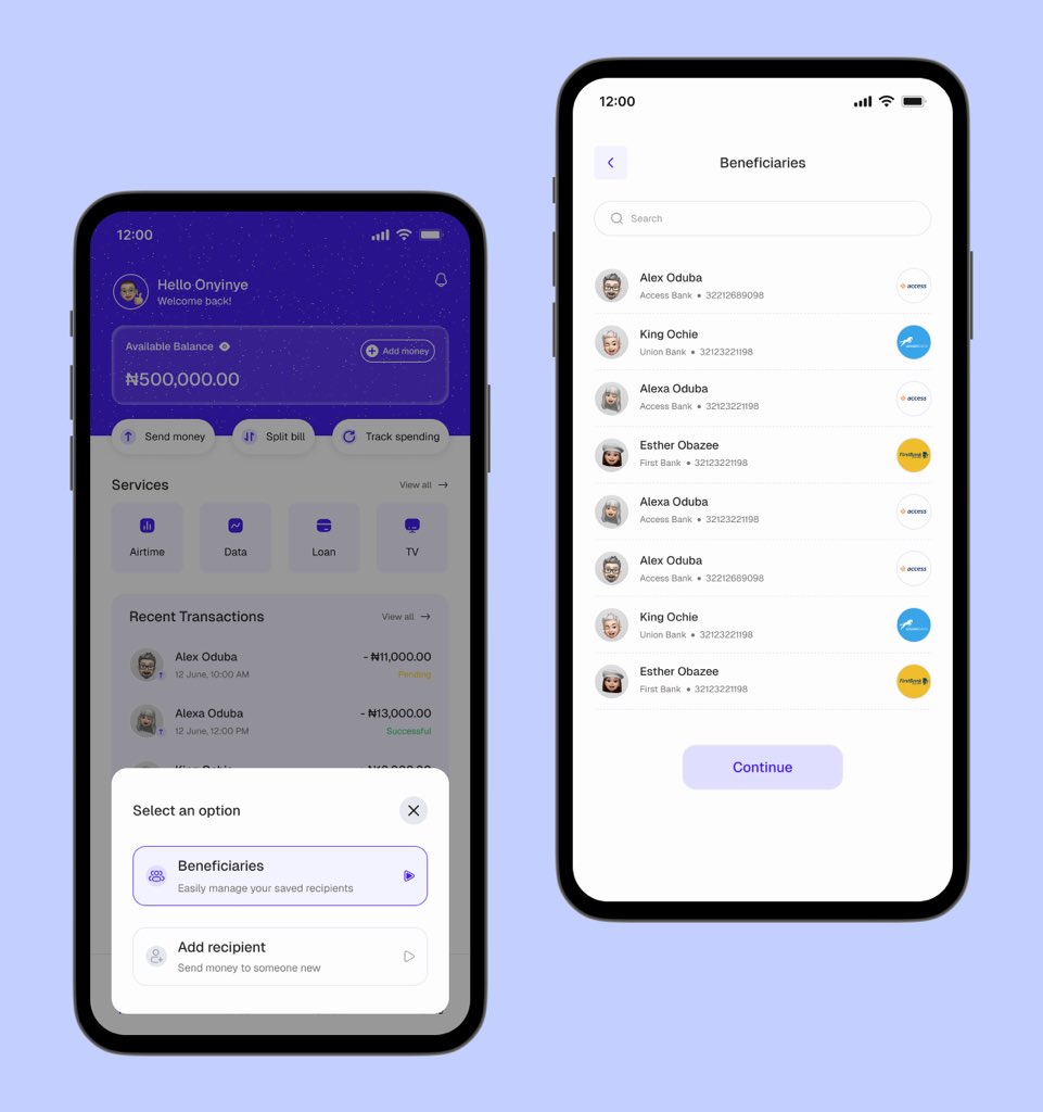
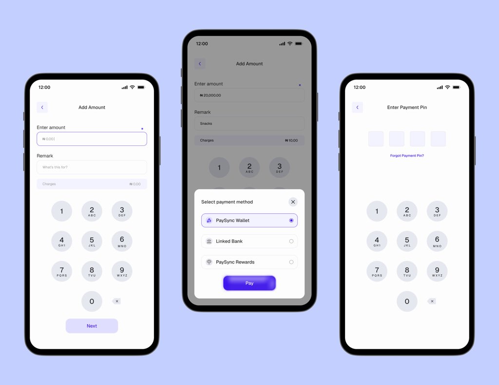
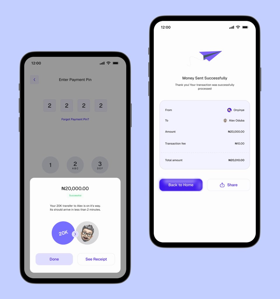
Designed a simple and smooth “send money flow” for a fintech app, PaySync. Also explored a fresh button style Mini case study coming soon… What are your thoughts?
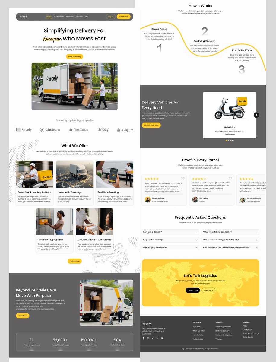
I designed a Landing Page for Parcely ✨ From wireframes to final UI, every step in this process sharpened my eye for hierarchy, spacing and clarity. Let me know what you think 🤗

Onboarding screens for a fintech app: VAULTA (a smart fintech app for payments, savings, and investments). What do you think?💭
I designed a Landing Page for Parcely ✨ From wireframes to final UI, every step in this process sharpened my eye for hierarchy, spacing and clarity. Let me know what you think 🤗

1. “There is no law that says icons must be 24px+” 24px is a convention, not a law. It’s a commonly recommended size because it balances visibility and touch target guidelines, especially on mobile. But can you go smaller? Of course as long as it’s still clear and usable in…
It’s Monday, start your week by firing up your design brain Here are some UI/UX reads to kick off your week 1. Don Norman’s principles of interaction design medium.com/@sachinrekhi/d… 2. Ui/UX trends 2025 medium.com/codeart-mk/ux-… 3 Don Norman’s seven important questions of user…


Annotation is my best Figma feature released this year.


It’s not always about choosing “nice” colors, it’s about choosing the right ones. Here’s why your palette might be failing your design (and how to fix it): 1. There’s no contrast. Your text and buttons are blending into the background. Low contrast = low readability = high…
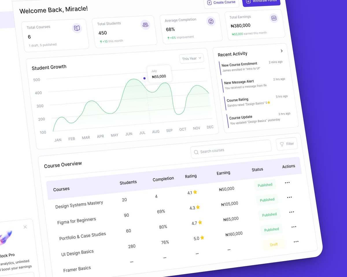
I designed a LMS Instructor Dashboard. From tracking course progress to managing earnings, creators now have full control at a glance. Thoughts?
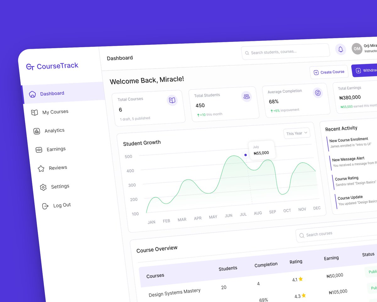

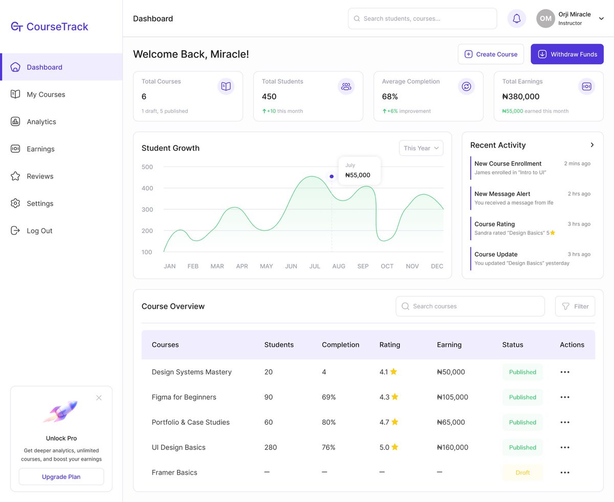
I designed an LMS Instructor Dashboard. From tracking course progress to managing earnings, creators now have full control at a glance. Thoughts?


Lesson 4. People scan screens based on past experience and expectations. People have a mental model of what they want to see and where they want to see it. Let’s say you come on a site or app and want to search for something, you expect the search bar to be at the top…
My new design read is 100 things every designer should know about. The more you know about people, the better experience you would be able to design for them. Taking each point a day at a time 💪 D-3
I went MIA for a bit… first my laptop gave out, then my phone followed 😭. I had so much energy at the start of the month… so many plans but life happened. Grateful for the kind people in my little corner 🫶 I’m back now, let’s make the most of it while we can! 🚀💻
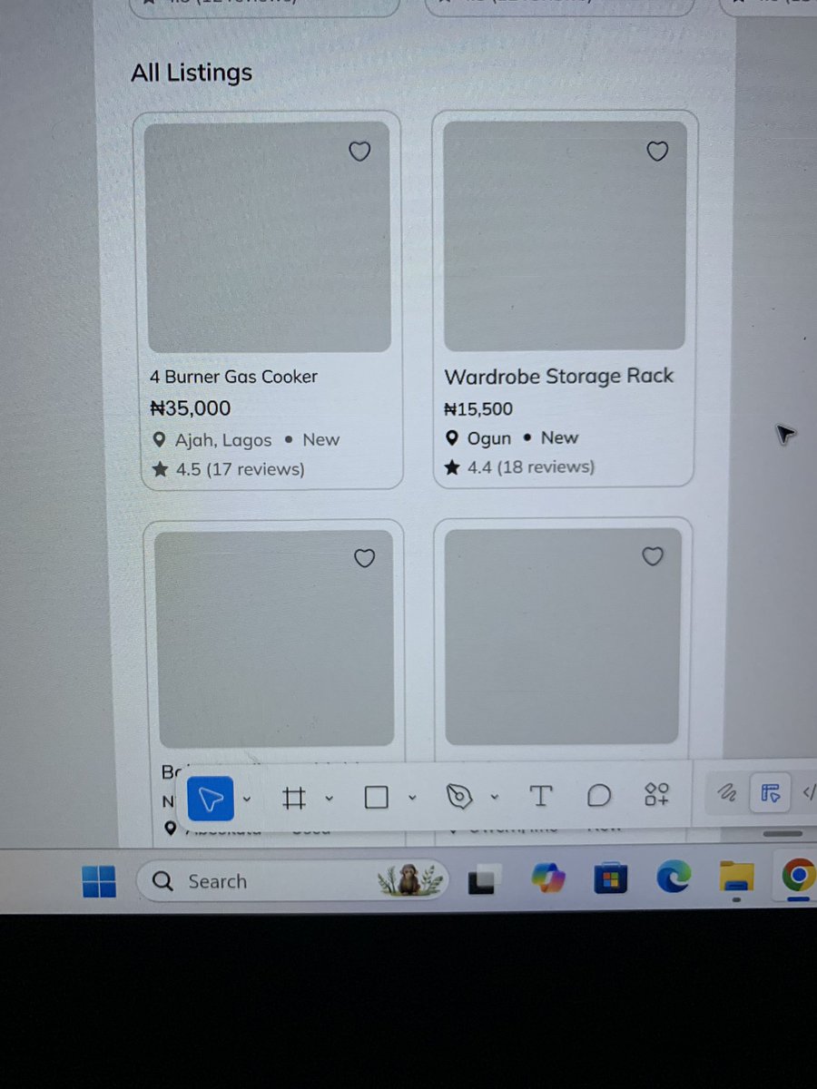
Which card layout works better for you? Left or right? Please add a why to your response 🙏 Also would you rather prefer a card having just the title and price? Why if so?

Which card layout works better for you? Left or right? Please add a why to your response 🙏 Also would you rather prefer a card having just the title and price? Why if so?
Good morning 😃 , Designers Stayed up late last night trying to do this prototype done. I ended up with a rough prototype that captures the core of it. It’s not complete yet, but I had to bring it to life. Sharing this early version to get it out there. Feedback is welcome! 👇