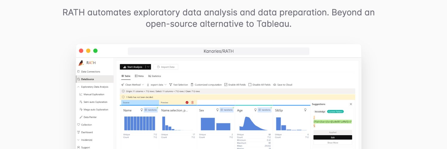
kanaries
@kanaries_data
Open Source Data Science, RATH, PyGWalker https://github.com/kanaries #buildinginpublic at @ob12er AI Agent for Jupyter https://runcell.dev
New Feature in PyGWalker: Data Painter How to clean some outliers, and clusters with complex distribution? Writing code for those dirty data can be hard sometimes. Here is a short demo that shows how data painter can help you clean those data within seconds. Tutorial here:
🏆 Congratulations to Runcell - Autonomous AI Agent for Jupyter Lab for winning yesterday on OpenHunts! 🔗 Check it out: openhunts.com/projects/runce…
Formally Introducing Runcell: An AI Agent for JupyterLab that understands Jupyter cells, writes code, executes code, and debugs for you. You can use it by simply running pip install runcell and using it in your Jupyter environment. Learn more about runcell at…
Runcell is now open for beta. A Jupyter native AI Code Agent, in your jupyter lab, it can understand your notebook, data, context and automate generate code and analysis cell results for you. Install the extension for your jupyter at runcell.dev
I'm working on a Code Agent for Jupyter users. It can understand what's happening in your Jupyter notebook, including your charts, dataframes, and errors, and automatically take actions to achieve your goal. It's Jupyter Native and works as an extension in your Jupyter. Feel…
No1. Most fast growing data visualization library: PyGWalker built by @kanaries_data. 5200+ new stars in 2024. It can turn your dataframe into a "tableau" UI for data visualization. You can make charts with simple drag and drop in your jupyter notebook github.com/Kanaries/pygwa…
Latest trending data about python data visualization is out. Check which python library is most popular for data visualization 👉
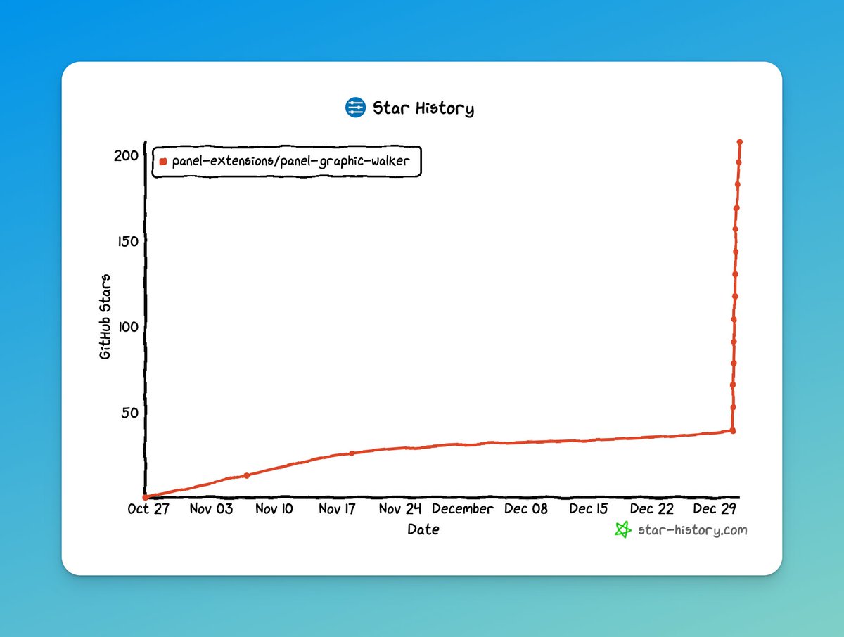
panel-graphic-walker from @Panel_org is trending on HN🔥🔥 A project providing a Graphic Walker Pane for use with HoloViz Panel. github.com/panel-extensio…
Working on a new plugin system allowing developers to customize the chart renderer in graphic-walker. Example of using @observablehq plot for charts. I'm planing to make graphic-walker/pygwalker to be an interactive data exploration wrapper on any plot lib.
EDA Reimagined in R: GWalkR + DuckDB for Lightning-Fast Visualizations medium.com/@bruceyu0416/e…

I just discovered PygWalker and this python package is insane. It's an embedded BI tool powered by DuckDB and WASM for use in Jupyter notebooks. All it takes is a dataframe and you can pivot the data for ad-hoc analysis in your notebook.
#PyGWalker es una útil herramienta para el análisis y visualización de datos para #Jupyter que convierte los #DataFrames de #Pandas en una interfaz de usuario interactiva para la exploración visual. Os lo contamos en el blog 📝⬇️ blog.onesaitplatform.com/2024/10/28/int…
今日からようやく工数予測AIモデル作成に着手。 最初のステップはデータの傾向分析からなのだが、PyGWalker(ピッグウォーカー)がかなり有用。普通はExcelピボットやTableauやLookerStudioなど使うのが一般的だが、下準備がほぼ不要で助かる👍。↓はGoogle Colaboratoryで動かしたイメージ。
Yesterday we told you how we had integrated #PyGWalker, an #OpenSource data analysis and visualisation tool for #Jupyter, into our #OnesaitPlatform #Notebooks. We told you about it on our blog 📝⬇️ blog.onesaitplatform.com/en/2024/10/28/…
Really cool extension from @Panel_org , now you can turn your dataframe into an interactive data viz panel app with a few lines of code🤯. github.com/panel-extensio…
📢New Extension Alert: panel-graphic-walker Wraps GraphicWalker by @kanaries_data. A Tableau like UI element. Can be used in Notebooks and Panel data apps. Currently scales to @pandas_dev dataframes on your server. 👇Link below #pyviz #dataviz #datascience #Analytics