Teodora @Designerants
@designerants
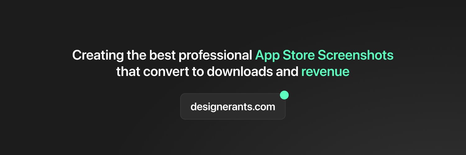
🚀 Order App Store Screenshots here → http://designerants.com 📱Screenshots tool http://getpicasso.com 💰App price tool http://pricelocalize.com 📈 Newsletter http://appgrowthexamples.com
App Store screenshots with text boost retention by almost 90% you must make it irresistible for the user to download your app don’t just say bs like “take control”, “feel the music”, etc that means nothing! you are losing app downloads and revenue just because of that #aso
If you always feel tired with no apparent reason it’s because you work where you should rest and you rest where you should work. Working from home has a mental toll. The mind needs context to perform at its peak. Every time you need to change context the brain needs to readjust…
Next decade Instagram will kill more businesses than paperwork and taxes combined.
.@designerants: "You can implement a life-changing hack in the next 10 seconds: Uninstall Instagram NOW"
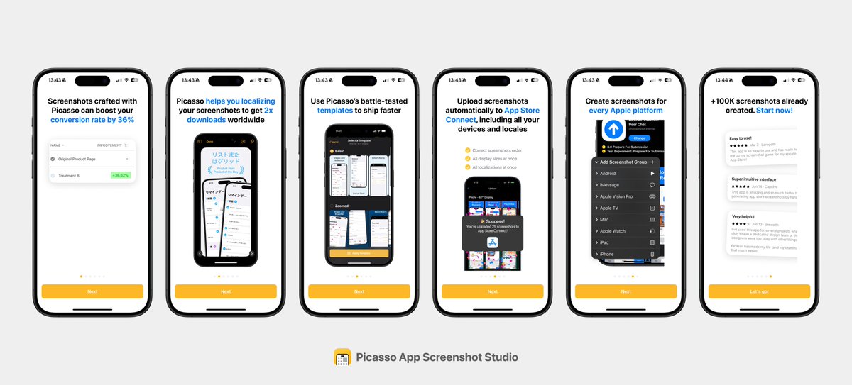
This is your sign to start making your App Store screenshots 👇
#iOSdev tool alert! 🚨 Picasso App Screenshots Studio app by @designerants helps you create professional App Store screenshots in minutes, not hours. getpicasso.com
Made a quick redesign @alexsllater
hey @alexsllater I know you guys are bringing 90%+ traffic from the outside, but I believe that if you do some creatives/screenshot improvements, you can increase your conversion rate and convert even more downloads. Especially, since this particular market (and your…
Every extra onboarding step increases churn. Your onboarding has 7 steps, but can be done with 3.
How would something like this fit in this philosophy?
It makes sense because your app is about breathing exercises. But making the user do an exercise without a reward feels like punishment. For the user, that feels like work.
i have a breathwork app. i’m re doing the onboarding right now, and had an idea to do a mini-breath exercise (one deep breath). this is how it looks now. keep or delete?
Permissions should always come after you state the reason why the user may be interested in them. Otherwise, you will have very low conversion rates. Most products can find good features to send updates to users, add a simple full page view with text, then trigger the Apple…
good to know this, i’m creating one rn and will change couple screens btw, do you think is a good idea to add permissions page there? (location, notification, etc)
Everybody makes this mistake. Onboarding IS NOT a tutorial. The key of a good onboarding is to get users excited about what’s next. Just like a movie trailer. Focus on: - Show the user what can achieve. - Showcase final results. - Avoid showing the steps to get to that…
Copywriting is good! I feel the 4th copywriting will work best, prioritize it. You need to zoom more. On tiny devices, your features will be hard to understand. You only need to showcase the first square in the 3rd one. You only need the first row of elements in the 4th one.
These are my app store screens 🤝 How can i improve?
None of the competitors in that category had shiny colors like yellow or orange. Easier to stand out and make users stop scrolling.
Interesting Why do you think this improved conversion, is it because it match the app theme
1. I tried multiple colors, not just yellow. 2. None of the competitors in that category had shiny colors like yellow or orange. Easier to stand out and make users stop scrolling.
Awesome! Why did you choose yellow and not another color?
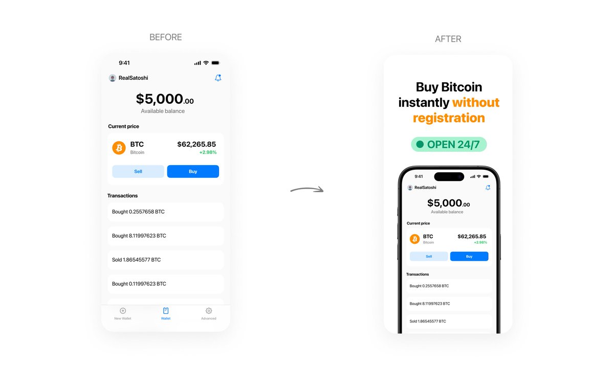
Before → After 1 background color change.
You should have posted before and after for more context