Alex Cristache
@AlexCristache
⬩ Founder & Principal Consultant (Design) @MindfulMotif ⬩ Seasoned designer and digital strategist ⬩ Explorer of art & color through #MindfulPalettes
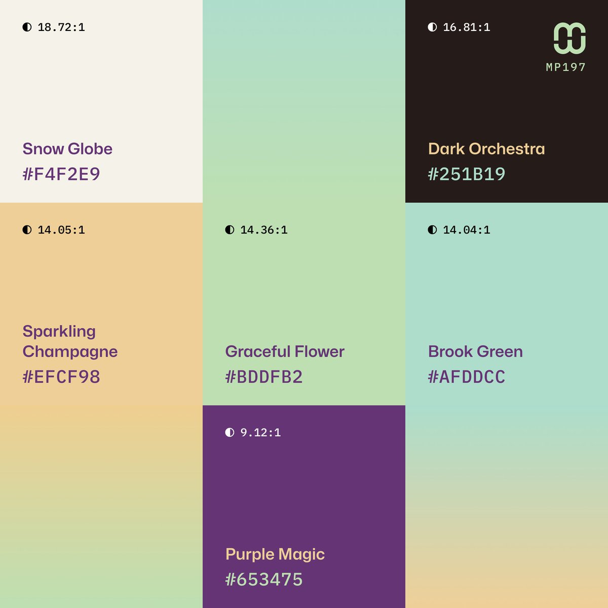
🆕 New color palette – #MindfulPalettes no. 197 is floral, delicate and uplifting with a grounded undertone. It’s perfect for brands and digital experiences that aim to feel fresh and quietly bold and playful. Free to use in your #UIdesign and #branding project.
Visual exploration with a minimalist 3 color palette and gradients. #Poster #Design #Inspiration
Minimalist #ColorPalette – 3 color combo: ⬩ Carrara Marble – E8E7D7 ⬩ Twilight Meadow – 51A5A4 ⬩ Violet Carmine – 531745
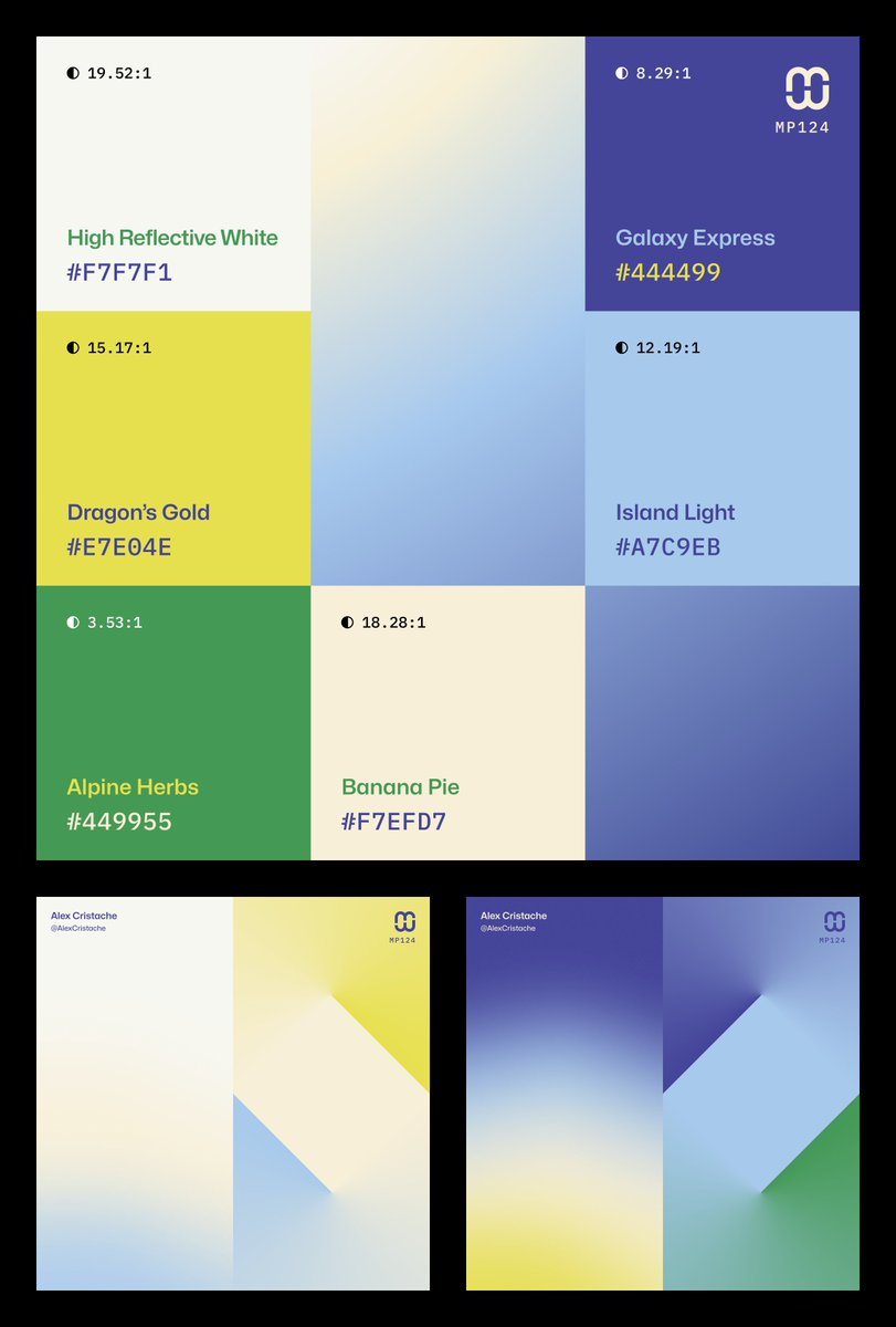
Happy Sunday, color lovers! 🌅 Searching the color palette archives again and I landed on #MindfulPalettes no. 124. Sunny, with a splash of watery coolness and citrusy flavor. Perfect while on vacation. Free for your #branding and #UIdesign projects. Sharing is appreciated.…
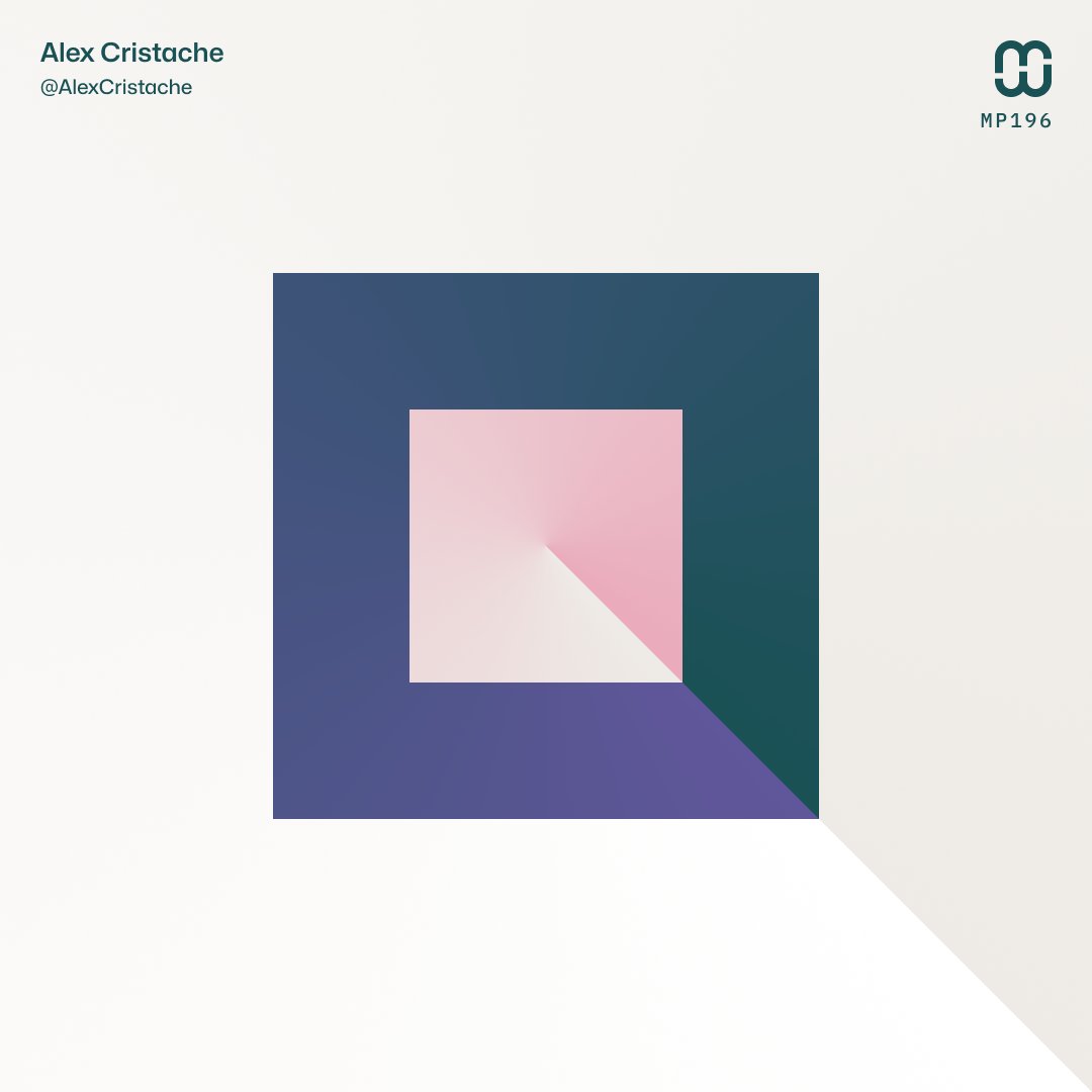
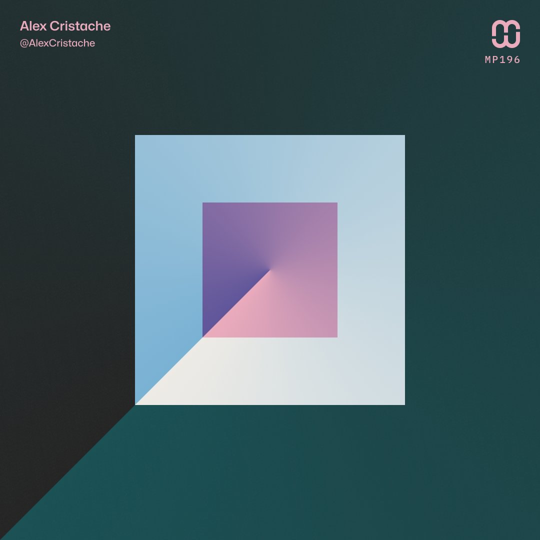
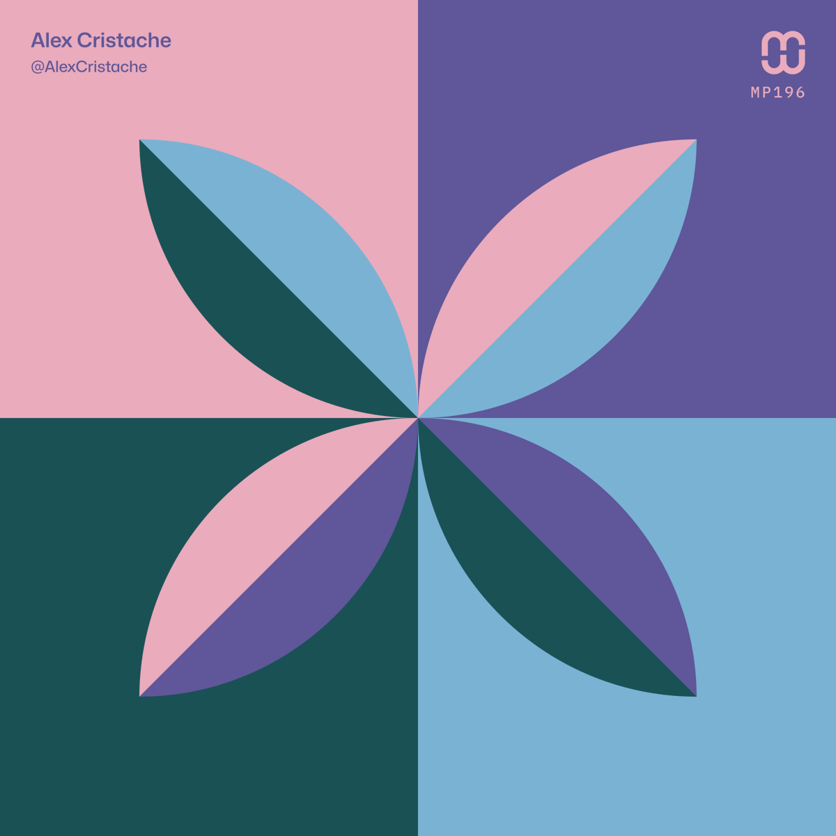
Squares and gradients with the #MindfulPalettes no. 196 color palette.
"At a glance" layout of #MindfulPalettes no. 196 for color palette collectors, artists, and designers. Free for your next #branding or #design project. Sharing is appreciated 🩷🩵💜
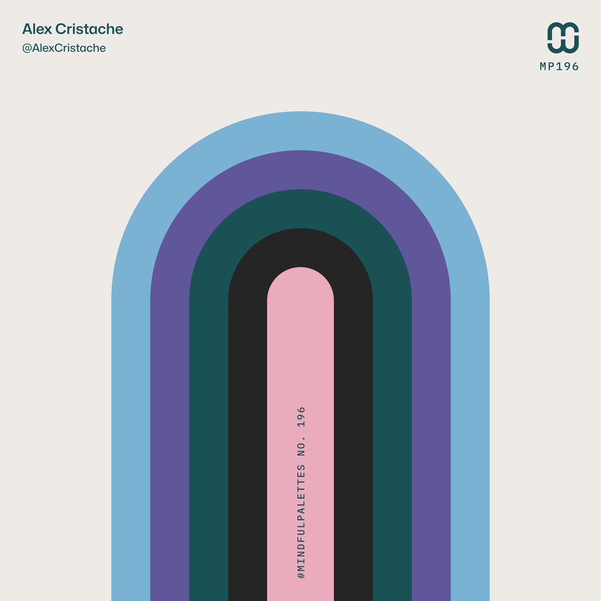
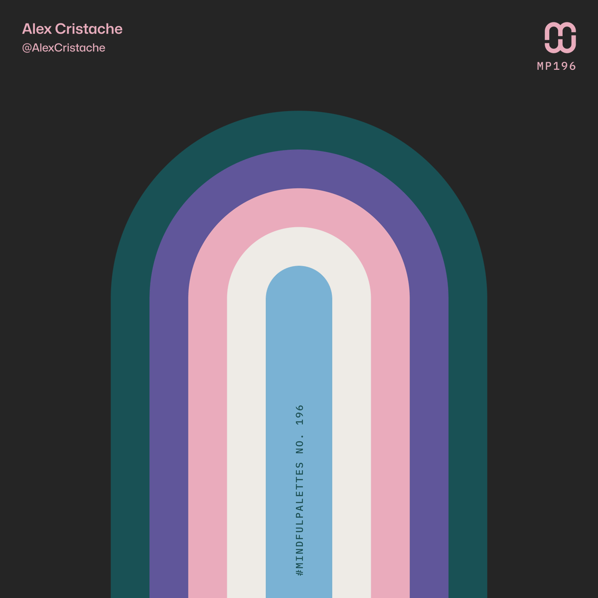
🆕 New color palette – #MindfulPalettes no. 196 is clean, balanced, and lightly playful, like a fresh bouquet wrapped in velvet ribbon. Perfect for expressive interfaces and brands. Free to use in your #UIdesign and #branding project.
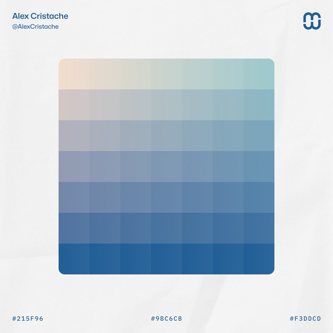
Color transitions based on a minimalist 3-color palett ⬩ Peachtree – F3DDCD ⬩ Continental Waters – 98C6CB ⬩ Lapis Lazuli Blue – 215F96
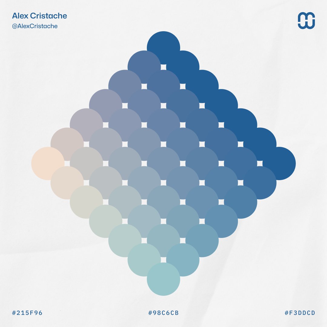
Color Interpolation Grid from a 3-color palette: ⬩ Peachtree – F3DDCD ⬩ Continental Waters – 98C6CB ⬩ Lapis Lazuli Blue – 215F96
Minimalist #ColorPalette – 3 color combo: ⬩ Peachtree – F3DDCD ⬩ Continental Waters – 98C6CB ⬩ Lapis Lazuli Blue – 215F96
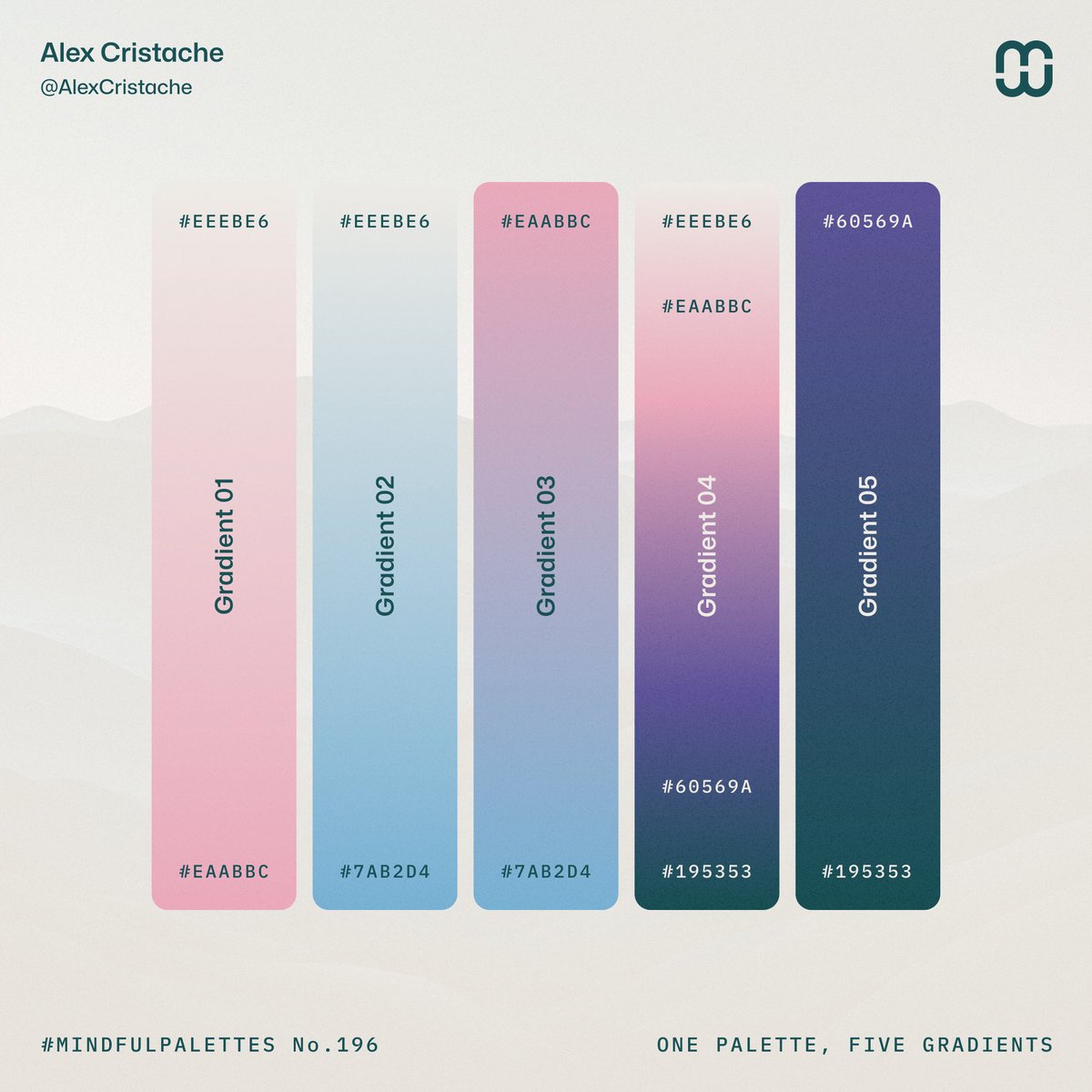
Happy, bright Friday with #MindfulPalettes no. 196 One color palette, Five beautiful #gradients. 👇 1. EEEBE6 → EAABBC 2. EEEBE6 → 7AB2D4 3. EAABBC → 7AB2D4 4. EEEBE6 → EAABBC → 60569A → 195353 5. 60569A → 195353
#MindfulPalettes no. 196 – Fresh and elegant like a lovely flower bouquet.
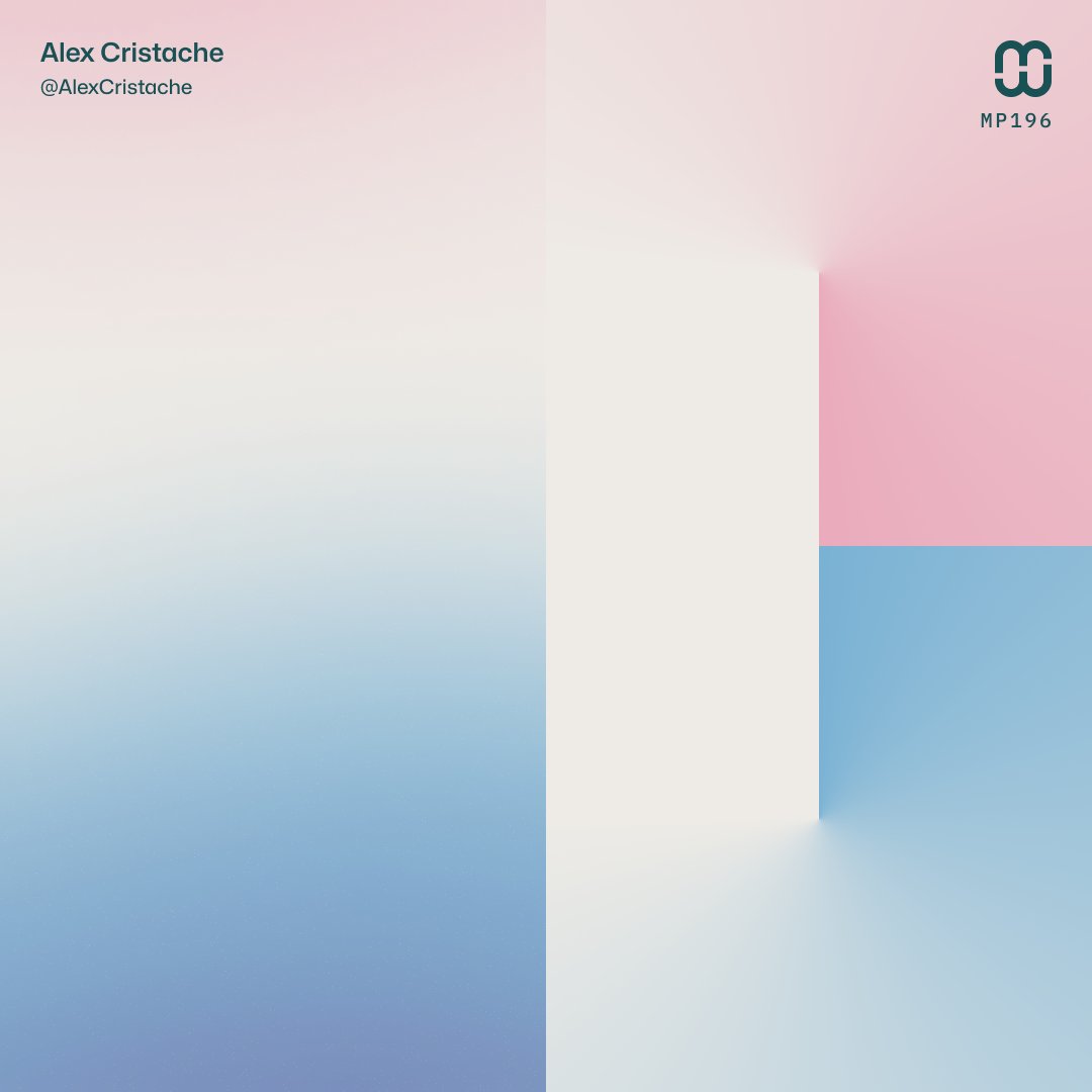
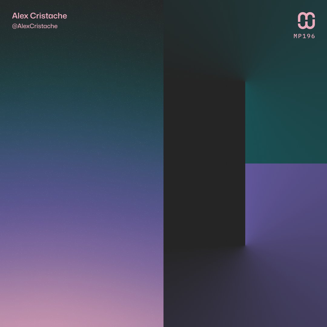
Light and dark #gradients from the #MindfulPalettes no. 196 color palette
Color stacking samples with #MindfulPalettes no. 196 color palette.
🆕 New color palette – #MindfulPalettes no. 196 is clean, balanced, and lightly playful, like a fresh bouquet wrapped in velvet ribbon. Perfect for expressive interfaces and brands. Free to use in your #UIdesign and #branding project.
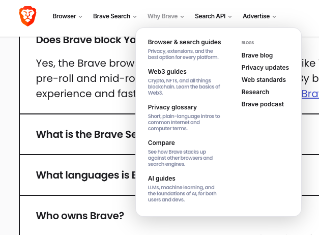
Who's reading that menu microcopy @brave? Even the navigation items are challenging. I know I can't... font-size: 10px; 😵💫 #Accessibility #UserExperience